For over a decade, Kalu Interiors has been creating stunning interiors for residences and commercial projects across Vancouver. A home designed by this award-winning firm means bright and airy interiors with incredibly intelligent uses of space and pops of colour where the home needs it the most, without being too boisterous. Kalu Interiors exude a quiet confidence with homes that seem effortlessly beautiful.
One of Kalu Interiors’ latest projects is an urban townhouse on Richards Street in the heart of Yaletown. This townhouse had been well lived in by its previous owners. The challenge was to take a dated townhouse that had retained most of its original design elements, such as narrow vanities, cookie-cutter kitchen cabinets, unusual niches, and dark finishes like cherry hardwood and charcoal grey ties which made the space look not only old and dated, but dark and depressing. But this space has great bones: soaring double-height ceilings, a concrete staircase, and plenty of natural light - unusual for street-level units. And these elements were perfect for Aleem and Phyllis to turn this old house into a home. We sat down with interior designers, Phyllis and Aleem, to discuss the latest trends in residential interior design.
Tell us about your design process for this townhome.
When approaching this project, our immediate reaction was, "what a perfect canvas!"; however, we needed to start with a blank slate. That meant bringing our canvas down to the studs and allowing us to build our vision from the ground up. Hitting the 15 year mark, this development was built in a time where the main selling point in a home was the number of rooms it had. Areas such as in-suite storage rooms and closets, dens, portioned-off kitchens made this otherwise open-layout townhouse, very claustrophobic. By simply bringing the space back to the studs and removing minor partitions throughout, we were able to instantly open up the space. Another trick we used to open up the space was in the master and guest bedrooms, where we added glass panels that offered a solid partition but also a visual aspect of openness. One thing we had strongly in our favour were the ceiling heights on the main level. We capitalized on these by adding interesting ceiling drops that allowed for us to incorporate recessed lighting throughout - something you rarely find in concrete structures such as condos and townhouses. Lighting is so important in any space, so we not only incorporated it in the new drops, but doubled the lighting allocations throughout the rest of the space on the main and upper levels. Another challenge was maximizing the flow and use of the space. Though it was ‘visually’ quite open with its large architectural windows on the front and back of the home, double-height ceilings and the removal of most walls, the overall floor space was tight. Our solution to this dilemma was: built-ins, built-ins, built-ins! We incorporated them into everything - bringing the kitchen to the ceiling, extending the kitchen outwards, incorporating the dining to the kitchen with built-in benches and storage, large bathroom vanities with drawer storage, and millwork throughout the master bedroom with added shelving and a built-in desk. Essentially, anywhere we could maximize flow and function, we did!
How would you describe the interior design style of this townhouse?
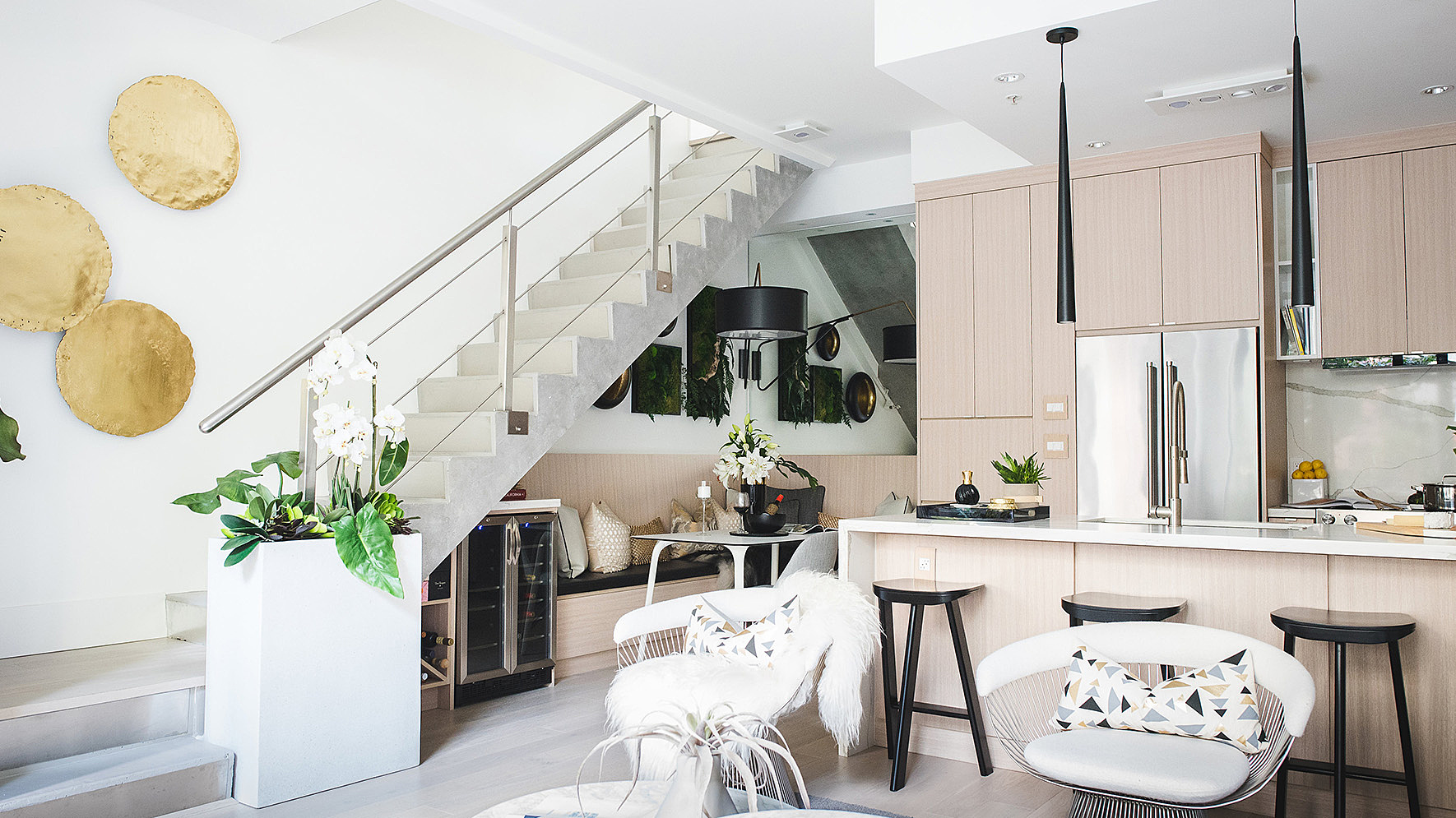
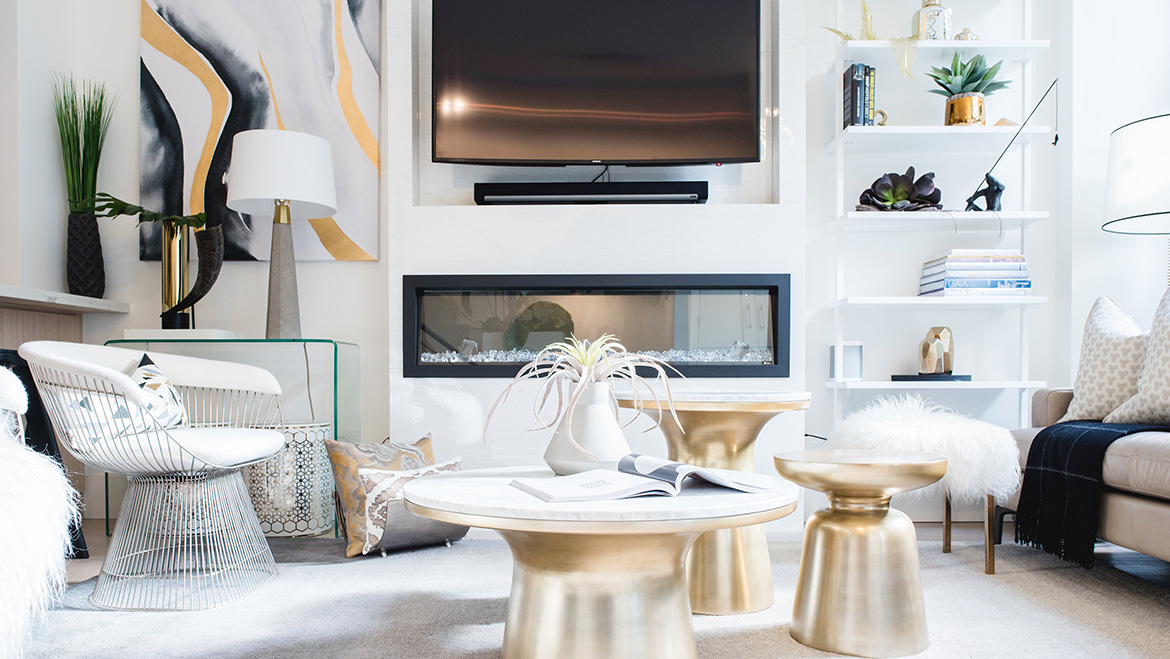
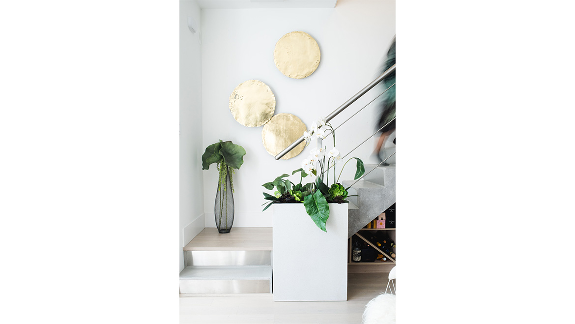
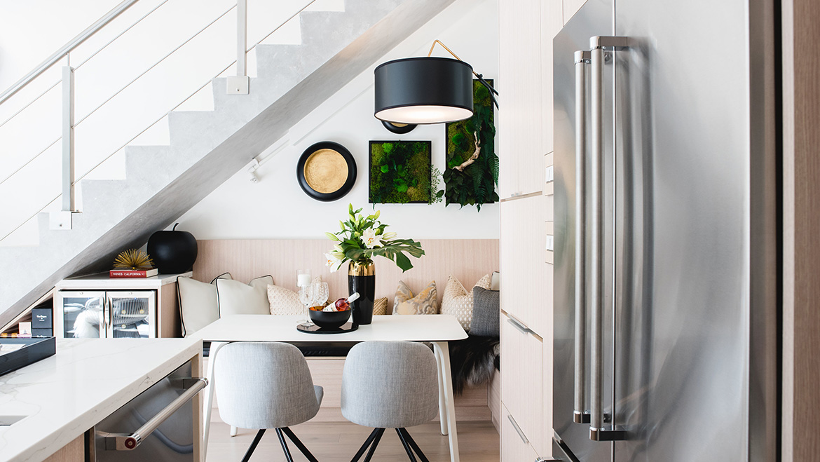
We think we would easily classify the overall aesthetic of the space as "Modern-Glam". Modern elements throughout were used, like whitewashed oak floors, pure white walls & trims in matte finishes, architectural baseboards, trims, consistent use of matching oak millwork, bright white quartz countertops with striking veins, polished white tiles and minimal texture all made the overall bones bright, clean and very modern. The home’s glamourous side came in through the use of lighting, furnishings and accessories. The strong use of contrast with black accents and an elegant use of gold touches took the space from stark to stunning and filled with personality and character. Additionally, we layered textures in accents pieces such as Mongolian sheepskins, metallic upholstery and lush plants on the walls and hanging from the ceiling, which brought whimsy to the sophisticated design. We love to play around with accessories because they can easily be changed out with the trends and with the seasons.
Are there any specific materials or textiles you love in the space?
As you’ll notice in the images, repetition is key in small spaces. They help ensure the overall feel that is emulated: bright, airy and expansive. In this space we went to town with quarter-sawn white oak. We loved the clean, minimal and elegant nature of not only the texture, but the colour of the wood - Nordic or Scandinavian inspired in it’s feel. But of course this was offset with the incorporation of other design elements and layers found within the space. We also love how the overall use of the white oak was contrasted with the equally natural feel of the marble-look quartz used throughout the kitchen countertops, backsplash, and bathrooms. This added to the open & bright feel of the oak throughout, though contrasted it with an element of surprise, by use of the strong veining found in this quartz material.
What do you love the most about this space?
We love how efficient it is! To this regard, we took function even more to heart than form (and you know that can be difficult for us designers!). For a typical downtown townhouse where space is at a premium, we had to take some untypical approaches. It was very important to utilize our design abilities and sensibilities to their best, while breaking some rules along the way. For instance, we wouldn’t typically incorporate a microwave into the dining area of a home, but by simply concealing it within a cabinet and incorporating a little creative hardware, it can be found directly next to the dining bench. By also ‘building-in’ the dining seating to the townhome, we were able to maximize space and even gain storage. In fact, we gained more space allowing us to increase the footprint of the kitchen.
When designing a new space, what’s one piece of advice you’d give?
At Kalu Interiors, we always work knowing there is much more than meets the eye. We design without letting what is there inhibit our creativity, as the possibilities can be endless. With that being said, there will almost always be obstacles and limitations in the design, such as structural and electrical. And in those cases, we work with and not against. The whole purpose of a well-designed space is ensuring it feels like it has purpose! We look at it as a puzzle, make every element fit together, and in result, work together. Because it's only when elements fight one another, a space can feel unsettled, unfinished, or uneasy to the eyes. Nonetheless, throughout our years of experience (without aging ourselves), we have almost always found that unique solutions only come from unique problems.
Check out all of Phyllis and Aleem’s projects at kaluinteriors.com.
